Course Block Filter
OVERVIEW
iD Tech is the leader in online/In-person STEM Education for children ages 7-19. They offer personalized learning from instructors recruited from the top universities like Stanford, RIT, and Caltech to inspire their students. Some of the features include: personalized college advising, gamified learning, and skill certified programs.
The tuition ranges from $60/lesson for Online Personal Lessons up to $2,500 for a university sponsored Teen Academy.
Role: Lead Designer • UX/UI
Cross-functional partners: Data Analytics, ENG, PM, QA, Creative
Goals of the project: Improve the user experience of finding a course/simplify the UI to generate more registrations for the business.
Project status: Live
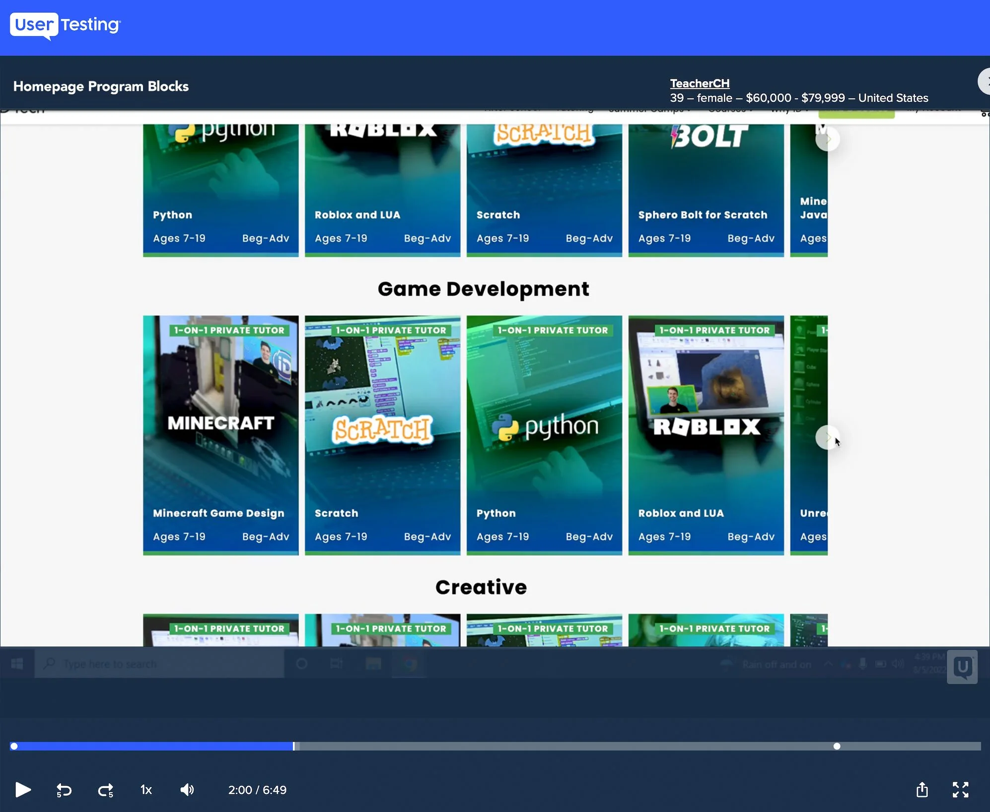
With over 100 courses offered online and in-person with 4 different lines of business (Which is continually evolving/expanding), the user is overwhelmed with the multitude of choices which can become frustrating.
The original design had an endless grid of courses which the user had to scroll the page vertically, as well as scroll/swipe each row horizontally to find the perfect course for their child. The problem was that most users, (Especially with new users) didn’t really understand the product offerings and the benefits for their child. These insights were revealed during user testing.
Too many courses + many programs = choice paralysis
THE PROBLEM
Original homepage courses block
DESIGN PROCESS: USER TESTING / INTERVIEWS
UserTesting.com is great resource to gain user insights. Besides seeing how users interact with your product, this platform is also a good resource to ask the testers open-ended questions during the test. I tested the current version of the programs block (live site).
Here are some insights from user testing:
Users were not sure how the programs differentiated i.e., online, small groups, academies and not really sure which program was right for their child
Users tended to get a bit overwhelmed when scrolling through all the rows of courses and programs
Some users wanted to get a better visual of the course
Users did know their child’s age and interests
Obtaining qualitative data
DESIGN PROCESS: SKETCH IDEAS
Adding a course filter made the most sense but finding its positions was a bit challenging since the layout is quite busy and colorful. Here are some initial ideas for the positioning of the filter control and the interaction of having a drawer slide out from the right or an overlay.
Lo-fi comps + interactions
The UI design also needed an update/refresh. The original layout felt a bit cluttered and the taller cards limited the number of cards that could fit in view. I decided to redesign the card UI by removing all of the elements from the overlay and placing them outside the card on the white background. The result is a much cleaner card design with improved visual hierarchy that showcases the course image and creates more readable text for the course details.
DESIGN PROCESS: PROTOTYPE / USER TESTING
User validation
I created a prototype to see if the design resonates well with the users and aligns with stakeholder direction.
*Please note: Original protoype was created in Adobe XD so there might be some rendering issues in Chrome. Thanks for your understanding.
Course filter prototype recording
The solution based on user feedback
DESIGN PROCESS: FINAL DESIGN
During user testing, we learned that users were confused when presented a myriad of courses and experienced a bit of choice paralysis. For the most part, parents do know their child’s age and interests so by positioning a filter with these two values was a huge benefit to the experience by surfacing the most relevant courses.
The feedback was very positive and based on Google Analytics, the filters helped raise the site's CVR by +24%
Other impacted metrics include:
• Filter Adoption Rate: 28% of sessions where at least one filter is applied (Before 8%, after: 28% = +250% Lift)
• Task Completion Rate: Reduced time to find a relevant course by ~50%
PROJECT REFLECTION